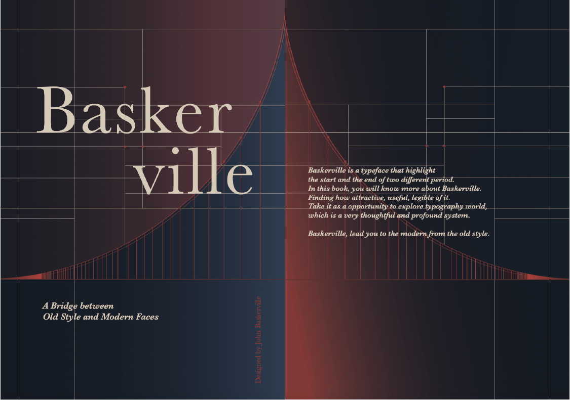
Baskerville is a 'bridge' between old-style and modern typefaces. I chose the bridge as my theme and used a gradient color scheme to express its transitional concept in an abstract, simple, and minimal form. For the color palette, I opted for navy and brick red because the transitional period is all based in the UK and does not have any French influence. The circular shape is frequently combined with the bridge in my book, particularly on each sectional page, to represent how it transitions through each period.
This is the first book that I have created. Although it is not highly crafted, it gave me a taste of designing a book. I have learned about the construction of a book, the basic knowledge of the grid system, and editorial design.
Size: B5 (175mm X 250mm) / Paper: Earth Paper / Binding: Stitch Binding
*Some of the images used in this project was obtained online—credit to the original creator.
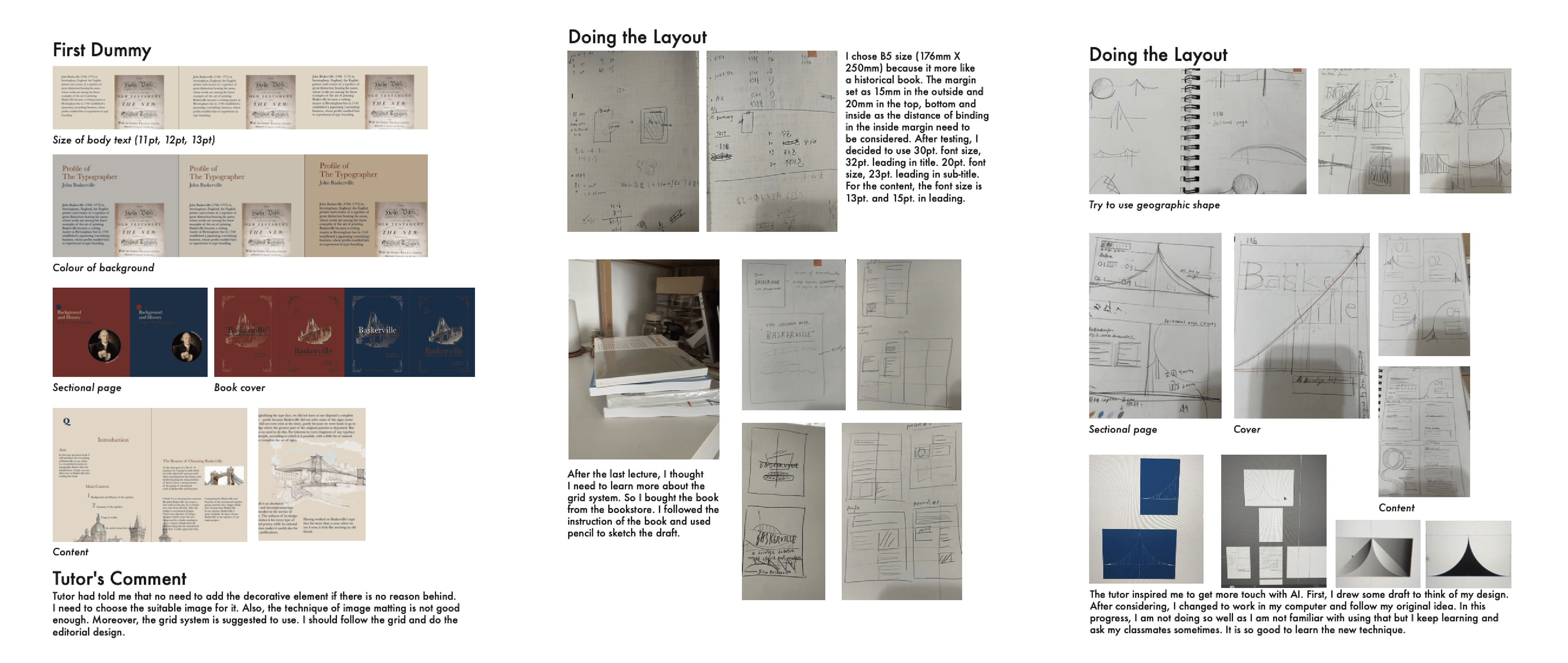
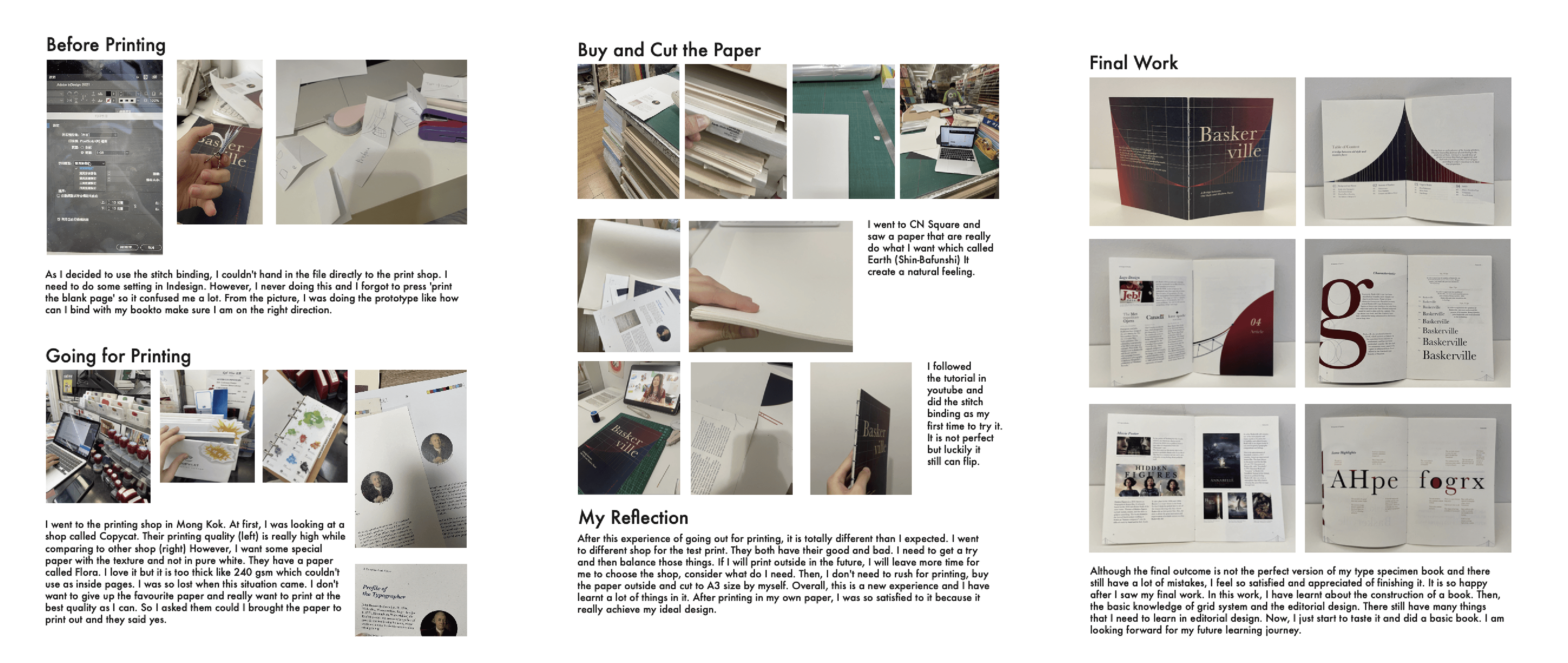
/ Process Development